puzzle 8:45, meta DNF (Matt)
We’re on edition six of the Muller Monthly Music Meta, so let’s congratulate Pete on his half-year anniversary. He started off easy on us but has toughened things up considerably the past few months, and October’s puzzle continued that trend. In fact, it’s the first Muller Music Meta that I’ve failed to solve. 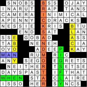
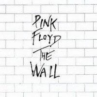
I haven’t made up my mind on the meta yet; it treads a fine line between lovely mosaic and jumbled mess. Decide for yourself: instructions read Four albums by the same well-known band are alluded to in this puzzle. The meta is the first one chronologically and the four album’s covers were described in some way: 6-down is BRICKS AND MORTAR, which describes the cover of Pink Floyd’s famous 1979 album “The Wall”:
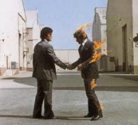
4-down and 42-across form the music festival BURNING / MAN, which also describes the combusting gentleman on the cover of their 1975 album “Wish You Were Here”:
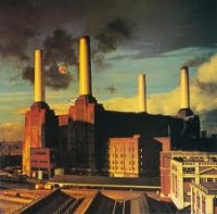
57-a and 40-d form WHEN / PIGS FLY, which describes part of the cover of their 1977 album “Animals” (that’s a huge floating pig between the two leftmost smokestacks):
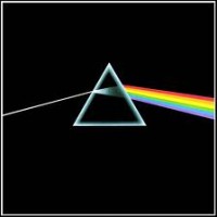
And the last one, which I had to have Pete explain to me (Brendan Quigley had told me the answer after I’d given up, but he wasn’t sure what the 4th album was himself): I’d noticed that BLACK and EBONY appear symmetrically opposite and leaned up against lots of black/ebony squares, but I didn’t see their connection. The idea is that it’s their album “Dark Side of the Moon,” whose cover is perhaps the most famous of any album in music history:
This makes DARK SIDE OF THE MOON the meta answer, since it’s the first of the albums chronologically (1973).
I like the following about this meta:
1) The idea of using album covers as the meta’s basis.
2) The idea of pointing to the album covers in a variety of ways.
3) The bizarre-looking grid and its lively fill.
But there are a few things that bother me about it:
1) The trick for “Dark Side of the Moon” seems inconsistent; in the first three, the descriptions are clearly of what’s going on on the album’s cover. But for DSoTM’s trick we’re referencing the album title, not its cover, which is famously a prism refracting light, not the dark side of the moon. I don’t mind the hodgepodge of references but to step away from the cover concept for this one entry doesn’t seem logical.
2) The asymmetry of the theme answers. The meta was tough in part because it was so knotty to figure out what were theme entries and what was fill; for a while I convinced myself that even BRICKS AND MORTAR was just fill! WHEN PIGS FLY and BURNING MAN being broken up so distantly was also a bit strange, though their very strangeness could have served as hints to the meta.
3) I didn’t solve it. Perhaps I’m just bitter?
Here are two of the more humorous false paths I took in the three hours I spent trying to crack this one: 1) spotting RUMORS (starting from square 43) and TUSK (NE corner) told me I was just about to crack the meta, but no MIRAGE or TANGO IN THE NIGHT. But it’s RUMOURS anyway, of course. 2) The clue for 28-a reads [Dir.from 6 to 40 in this grid] for SSE. Just in case I started at the 6 and went SSE towards the 40, and the first four letters were B-A-N-D. That cost me 10 minutes.
So overall I liked more things about this meta than I disliked; unless I’m missing a subtlety (tell me in comments if so) the biggest ding comes on the “Dark Side of the Moon” issue mentioned above, but that’s not enough to negate the cleverness of the covers idea combined with with a grid that was, in the end, more lovely mosaic than jumbled mess.
Let’s say 4.00 stars, and now with the pressure to be perfect off of me I’m looking forward to redeeming myself in November.
Yeah, I got the correct answer, but I felt like either I was missing something, or the meta just didn’t quite work. I tried convincing myself that the triangle shapes in the grid were moons with “dark” sides, or that they were prisms with a beam of light coming off of them (though oriented incorrectly), but neither explanation seemed especially plausible to me.
In the end, I had to go with Dark Side of the Moon, because it’s one of the most iconic album covers of all time, so any other answer wouldn’t have been as satisfying.
Yeah I didn’t explain that right in the post. The idea is that those two black-square conglomerations could be said to resemble moons, so the EBONY and BLACK against them are each a “dark side of the moon.” But why would there be two dark sides of the moon instead of just one?
It’s slightly confusing that the dark side of the moons have no letters in them, and the words BLACK and EBONY appear in the light side of the moons.
Yeah, this one didn’t seem to play by the rules. The albums beside DSotM are full answers in the grid, not partials of other answers. Also, as Matt explained, they described the cover, not the title. I submitted Atom Heart Mother, since it had a cow’s ASS prominently displayed, but I figured it was wrong, since there was no reason Pete wouldn’t have put COW in the grid. I don’t mind missing these if I just didn’t follow the logic, but this one seemed like two separate metas.
Thanks Matt for the write-up. I agree with your comments. I wish I hadn’t decided to make the puzzle a little harder at the last moment – originally the meta was just asking for a band name, but I thought it would be too easy to guess Pink Floyd.
While Animals, The Wall, and Wish You Were Here are represented by phrases referring to their album covers, Dark Side of the Moon is represented visually. My only (lame) excuse is that I was trying to place a visual wall down the center of the grid. Despite my blundering, 51 people found Dark Side of the Moon.
18 submitted Wish You Were Here (there are some EBONY EYES on a later live Pink Floyd album), 8 found the cow’s ASS on Atom Heart Mother, and 7 found somewhat plausible justifications for the albums Relics, Meddle, and More.
I’m not sure which answers I will accept yet, but there’s a good chance the alternate answers will get at least partial, if not full credit.
Sorry – next month’s puzzle will not have any ambiguity.
Huge Pink Floyd fan with a bunch of live shows from the time period of all 4 albums, which gave me a lot of confidence. 2 weeks ago I watched a documentary on the making of Wish You Were Here, and they spent a segment on the album cover with the man on fire – so that was fresh in my mind when I saw Burning Man in the grid. The “Pigs Fly” answer solidified that Pink Floyd had to be the band in question. However, I submitted my Dark Side of the Moon answer without any idea how it fit in. Did it have to do with the 16A answer CAMERA corresponding to the puzzle title PICTURE THIS, with camera light being associated with prisms of light? I’m sure it didn’t, but I plowed forward anyway…
Sigh. I couldn’t find DSotM — I got the others — so didn’t enter, cause I wasn’t sure what the 4th album was. D’oh! BLACK and EBONY should have been enough, given the unusual grid arrangement. I actually ended up reading several articles on PF looking for SOMETHING to attach to, all the time wondering WHY he wouldn’t have put DSotM in the grid somewhere!
Sheesh! Do I have to turn in my hippie card now?
I’m also a huge Pink Floyd fan – thanks, Pete for the fun visit to memory lane! The album that does indeed have ebony eyes on it is Pulse, which seemed consistent to the cover art theme. This made Wish You Were Here the earliest album and my entry. I considered the Ebony and Black symmetrically placed with (Neneh) Cherry as representing the colors on Dark Side of the Moon, but there were other albums like Saucerful of Secrets that also had these colors prominent in the design. I even tried to find a moon shape, but there wasn’t really one, so I didn’t think DSOTM strong enough. Still, overall, an excellent puzzle and nearly an outstanding meta.
I felt pretty confident about Wish you were here.
The 1995 album Pulse had a huge eye on the cover with a large black center.
That seemed like a clincher.
In the same-ish boat as genefaba, for the black I clearly had “Final Cut” – which is basically TOTALLY BLACK with a couple of rectangles on it. Which would make the answer Wish You Were Here
If the grid had “prism” or “diffraction” it would have been a different story. I’m curious why people chose DSOTM over Final Cut? Because it’s much more famous?
To be honest, yes. When I think of Pink Floyd, I think of those 4 albums, starting with Dark Side. I love Meddle and enjoy some of the older, crazy Syd Barrett stuff too, but the guts of my love for PF are those exact albums. I noted the EBONY/BLACK thing too, but couldn’t make it stick to anything. Same when I looked at Final Cut – nothing stood out, so given the choice b/t Dark Side and Final Cut it had to be Dark Side.
I ruled out Pulse because it was a single eye, and also the iris was gray – I would think that most images of eyes have black pupils, but it wouldn’t make sense to refer to any black pupils as ebony eyes. However I could not rule out The Final Cut, which was mostly a black background with a flower and some stacked ribbons / medals. I arbitrarily chose TDSOTM because it was closer chronologically to the other three. But I was hoping I missed something more telling.
Yes but there is no such thing as black irises. Ebony eyes just refers to dark eyes which a large black pupil may include.
I interpreted the black chunks as simply triangles; those and EBONY/BLACK led me to think the black triangle was being described. So I got it right.
Another vote for triangles=prisms here while solving — they definitely stood out, so I decided they should be important, somehow.
I got the right answer, but totally missed the album covers concept-I read “Picture This” as get an image from the grid. So bricks and mortar was a visual “The Wall” and the black and ebony sides of the crossword grid half moons were DSOTM (though I wasn’t sure about two moons). I guessed Animals from when pigs fly, but couldn’t find a fourth. So since none of the earlier albums seemed likely, I just picked the earliest of those 3. I like it even better now that I know the real meta!
I took EBONY EYES as a whole answer and never considered using partials, since I was able to find 3 clear full answers that fit a theme, so why not the 4th? I also couldn’t find any connection between DSotM and EBONY EYES which to me seemed like the most likely 4th answer, try as I might (and try I did).
So I used that answer to interpret the Pulse cover, and ended up with Wish You Were Here, which I submitted.
Enjoyed the puzzle and the theme very much, but did feel slighted on the meta as that logic ultimately felt more like an arbitrary, interpretative guess. That said, I always appreciate the effort and craft that goes into these.
All that said, so as not to complain, I know that I couldn’t create this, given a million random empty grids to fill and infinite time.
Ack! You mean “Mas” wasn’t describing the word “More” on the cover of the album of the same name? Seriously? But all the other ones were things on the covers and clear entries in the grid. “More” is notable because unlike most Floyd albums of the era it actually had words on the cover, though I guess it’s not on the new re-release. Grumble grumble.
Sorry Abby
Nice find…you do get partial credit as do all other solvers who submitted other Pink Floyd albums.
I never considered the puzzle squares to be moons. I thought they were pyramids, sitting (albeit sideways) on black. Didn’t bother me that there were two of them. Nor was the absence of the rainbow of light an issue, since none of the clues were describing the entire cover (well, except for The Wall, I guess) but rather a single element thereof. Name a Pink Floyd album with pyramids and black on the cover — where’s the controversy? Nice meta.
Actually, there *are* two prisms on “Dark Side of the Moon” if one unfolds the cover flap. And the horizontal ray of light coming in from the left and exiting at a different height on the right is pretty accurately reflected by the black bars to the left of 25 and to the right of 45.
The full cover image can be found here: http://i537.photobucket.com/albums/ff338/louishiggins_2008/DarkSideOfTheMoon-BackFrontCover.jpg
Nice find Charles!
Wish I could say those prisms were intentional…hmmm…now that I think about it I must have put them in there subconsciously :)
Coming to the discussion late, so no one is likely to see this, but just wanted to jump on the two prisms bandwagon. I remembered the full album cover having the right side up and upside down prisms and thought that was perfectly represented by the puzzle grid. Never picked up on the moon with ebony and black idea. Funny that I thought this was a rock solid meta, but for the wrong reason!
I think it helped that I was listening to Joni Mitchell while all you cool people had Pink Floyd on your stereos. Without the puzzle title, “Picture This,” I wouldn’t have gotten anywhere. I never noticed the half moons in the grid, but I saw that ebony and black were symmetrical. The cover of Dark Side looks black to me, almost ebony, and since it was the only Pink Floyd album I had ever heard of, I submitted DSotM as my answer.
I agree with Charles M., there are two prisms on the full artwork for DSOTM… once I saw the BLACK & EBONY bases and the red (CHERRY) line between them, I had a nice moment of realization… especially since these 4 albums make up Pink Floyd’s peak of popularity, I knew Dark Side was in there somewhere!!
I feel dumb…I saw the Pink Floyd albums (3 of 4 at least) but read the instructions to submit the first PF album. So I submitted Pipers at the Gate of Dawn. Partial credit please?